
This is a follow up article looking at some of my favourite comic artists. As with the previous article, I’ll try to articulate what it is I like about these artists and their art.
Dave Gibbons
Dave Gibbons is an English comic artist, probably best known for his work on Watchmen. His rich body of work across the comic book industry includes comics for Marvel, DC, 2000 AD., Vertigo and Dark Horse Comics.
Dave also published a book with Tim Pilcher on making comics, simply titled “How Comics Work”. I highly recommend this as it gives a deep insight into Dave’s thinking and approach to making comics.

For me, some of his best work is on Watchmen. The sheer detail in those comics is astonishing. The detail goes beyond just drawing people and objects precisely. You are likely aware of the famous strict, 9 panel grid structure that Watchmen follows throughout the story. Now 9 panels is quite a lot for a comic page. Considering that panels need room for speech bubbles, captions, multiple characters and background detail, you soon realise that it takes a competent artist to make the panels coherent and visually appealing.

Dave uses clear line work, producing crystal clear details that are easy to read. In fact, if you really want to appreciate the detail that has gone into Watchmen, pick up a copy of “Watchmen Annotated”. The additional notes really highlight the amount of thought and work that went into building and fleshing out the world in the story.
I love his confident, clear use of line-work and his use of black really adds weight to pages. Contrast draws the eye into the page and adds depth.
Sean Gordon Murphy
Sean Gordon Murphy is another one of my favourite comic artists. Working traditionally, he uses a mix of pens and brushes to produce a style that feels lively but precise. Anyone that has followed his work, knows that he enjoys drawing vehicles and he rarely passes up a chance to include stylised cars into his books. His style almost feels like a mix of Manga and American comics.
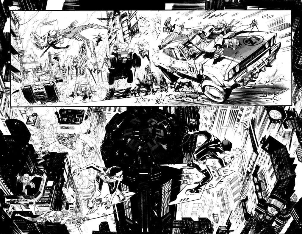
He draws characters in proportion and doesn’t shy away from detailed backgrounds and set pieces. Once again, he uses heavy blacks to create mood, frame panels and add weight/depth to characters. In fact, when doing a sequential page by page comparison of Sean’s work to most artists today, I don’t think anyone else uses as much black as Sean. I have an A3 artist edition of one of his issues and the pages are wonderful to look at. His art is consistently good and his style is instantly recognisable. A simple colouring approach compliments Sean’s art due to the amount of detail he draws. For those familiar with his work, you’ll know he has often teamed up with Matt Hollingsworth who injects colours that really compliments the inks.

Sean has shared some insights to his process over the years on his DeviantArt account, showing how he uses reference to assist his drawing as well as how to successfully draw cars (especially wheels) in perspective.
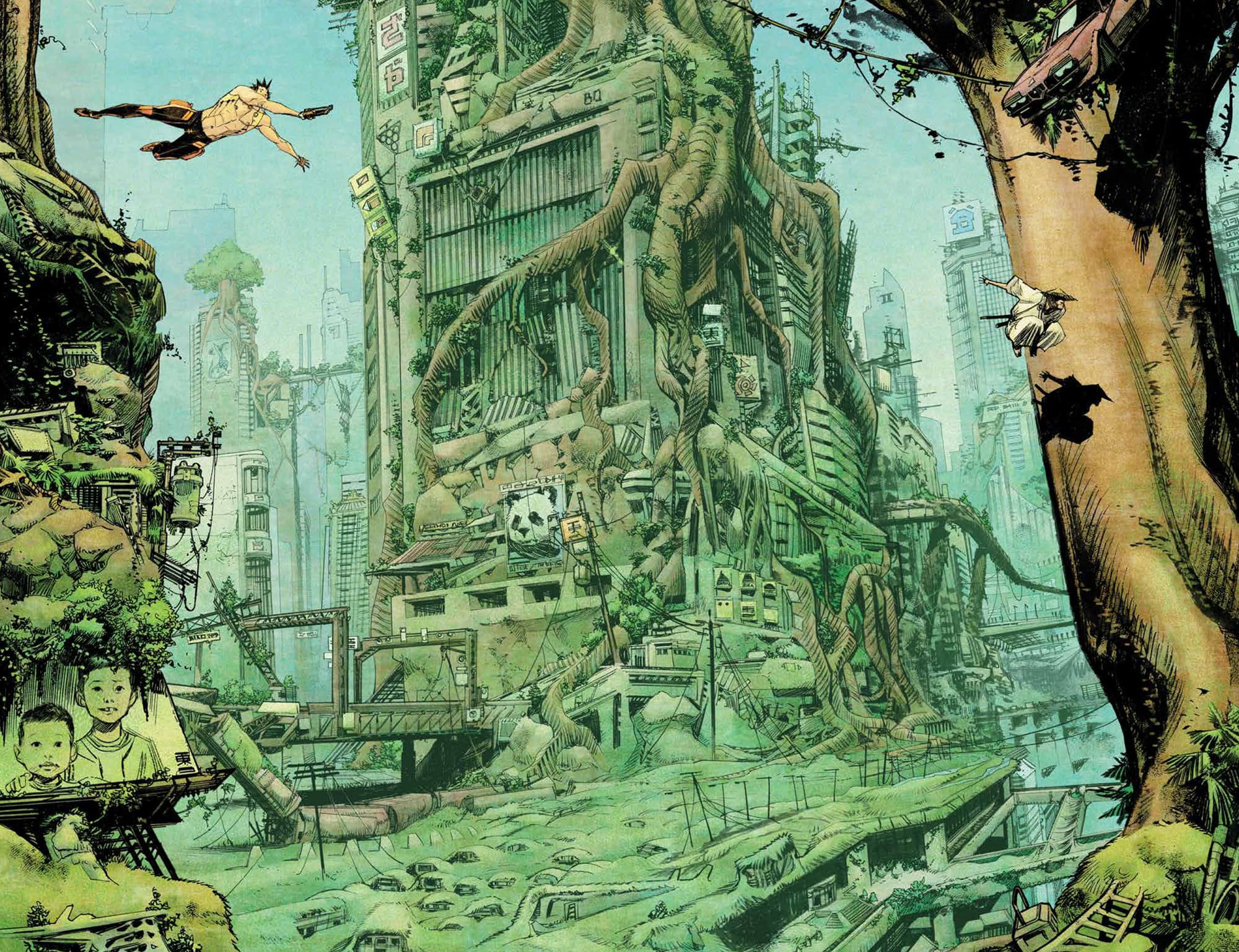
Jorge & Gerado Zaffino
Jorge Zaffino and his son Gerado are both amazing artists. I came across Jorge’s artwork when browsing Pinterest and I was immediately drawn to the dramatic but natural facial expressions as well as the… you’ve guessed it… use of black. He uses a huge amount of black ink from page to page, often with more black than white being shown.


A good level of artistic skill is needed by artists when using heavy amounts of black ink on a page. Used haphazardly, details can be lost, or things can look messy, often feeling like scenes are depicted at night even if the sun should be shining brightly. You won’t find any of these problems in Jorge’s work and his art would look great framed and hung on the wall.
They say the apple doesn’t fall far from the tree and that’s certainly true with Jorge’s son Gerado. Gerado is an incredible artist and although you can see some similarities between him and his fathers artwork, he has a unique voice and style. What are some of my favourite parts of Gerado’s work? His use of details and black ink. Is it becoming clear what draws me to certain artists? I’ll write a little more on these features at the end of the article.


Now just because you throw a bunch of lines down on the page, doesn’t mean the art has detail. Sometimes having more lines on a page can mean camouflage for the subject matter instead emphasising where the readers eye should be directed. Gerado’s art expertly uses contrast showing a masterful understanding of light and form.
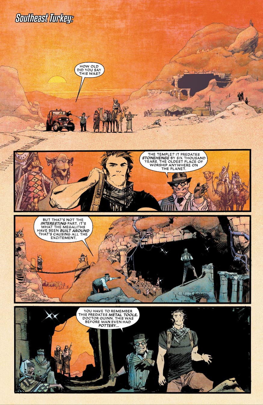
Lee Weeks
I recently started showing an interest in Lee Weeks when I came across his work with Tom King on Batman and he has since been added to the list of favourite comic artists. There is something very classical about his art, and its not easy to articulate. It almost has a retro feel or some European comics like the Dylan Dog artists. Body language and dynamic posing clearly show character emotion and drama . This works really well for on Batman as his face is often covered and he usually has a scowl as an expression.


In addition to using a black ink generously, Lee often uses a grey-scale wash or zipper-tone effect to add more dimension and depth to his pages. His art has precise proportions, using varying line weights to indicate light sources. This helps his drawings to pop off the page.


I’ve often heard illustration being compared to written language. An artist will interpret an image and decide upon a representation of that image using a select amount of lines (Scott McCloud writes about this in “Understanding Comics”). Lee draws people and objects with a simple yet satisfying style. Faces have a minimal amount of lines (compared to some of the other artists in this list) yet they are extremely pleasing to the eye.
In Conclusion…
You’ve probably seen a recurring theme in the artists that I like. Most of the artists draw detailed, realistic styles with a heavy use of black on the page. I can articulate further why I feel the use of black is important. Black ink can help add weight to characters and it can even guide readers eyes across panels and pages when used correctly. There are many tools at an artists disposal when creating comics such as perspective, anatomy and composition. But I often find that contrast is something that gets overlooked, leaving the colourist to add contrast at the colouring stage.
Thinking back to a short course I did years ago on colour theory, the course surprised me as I learnt that the eye is first drawn to contrast before hue or choice of colour. Contrast goes hand in hand with composition and if you squint at a page the dark and light areas or the contrast will dictate the shapes or composition that the eye detects. This in turn influences the look and feel of the page or panel. This is likely why I’m drawn to artists that use a lot of black within their work. But there are other factors, precise anatomy and perspective adds a sense of realism that I find pleasing to look at and all of these artists steer away from an exaggerated or extremely stylised way of interpreting people and objects.
I hope you’ve enjoyed these articles, sharing some of my favourite comic artists. It can be a useful exercise to examine the artists you like, asking yourself why are you drawn to a particular style. It can help you breakdown and identify ways to improve your own art and hopefully help you create even better comics and stories. Who are your favourite comic artists? What kind of styles are you drawn to? Do you find yourself drawn to the same kind of styles? Let me know and leave a comment on the post.